
ow that the site’s wireframes have been generated during the architecture process, we turn them into mock-ups using visual elements such as a logo and an icon set; visual conventions such as a color scheme and a typeface collection; and visual rules such as a grid layout. Design appears in Jesse James Garrett’s useful “Elements of User Experience diagram”:http://www.jjg.net/elements/pdf/elements.pdf as the top level, labelled Visual Design.
As well as these elements, conventions and rules, the design must take into account a number of considerations that may initially appear to conflict until, with work, the tensions among them coalesce to actually form the design.
Dieter Rams, renowned industrial designer, has “10 Principles of Good Design”:http://designmuseum.org/design/dieter-rams.
Good design:
# is innovative
# makes a product useful
# is aesthetic
# helps us to understand a product
# is unobtrusive
# is honest
# is long-lasting
# is consequent to the last detail
# is concerned with the environment
# is as little design as possible.
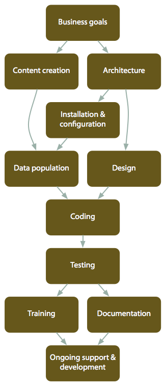
The entire process, with dependencies